


what if...?
As a racquet sports enthusiast, I was determined to improve the experience and attract more people to the courts. While identifying potential pain points, I was inspired by the lack of accessible, personalized tools for non-professional players who want to grow through practice and data — not just performance metrics, but meaningful insights. What if I created a solution for this problem?
research

The project began with foundational research aimed at answering the most important question:
What should I build?
During this exploratory phase, I combined user interviews and surveys to identify behavioral patterns, needs, and pain points. From this, I developed three user personas representing key user segments, which helped align design decisions with real user needs. I also carried out a heuristic analysis of similar platforms, identifying usability gaps and inspiration points to differentiate the experience DUZZ could offer.

Simplicity is key
My main struggle during this phase was leaving my assumptions and biases behind. I discovered that by writing them down, I could keep them in sight to ensure they didn’t interfere with my research process or conclusions.

No coach but still clear and personalized guidance.

Visual feedback is highly valued

Users are more motivated by enjoyment than competition

Gamified and visual progress indicators

bite-sized, flexible training plans
ideate
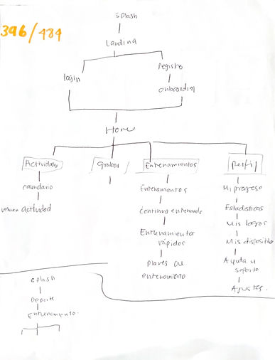
Based on the research findings, I defined the core experience around three pillars: accessibility, personalized coaching, and multi-device continuity. I created user flows and an information architecture that prioritized clarity and quick access to relevant content. The app’s ecosystem was structured into mobile, smartwatch, and web platforms—each playing a distinct role. Wireframes were created with special attention to the amateur user journey, ensuring intuitive navigation whether the user is recording a match, following a training plan, or reviewing their performance data.
_page-0001%20(1).jpg)
The process to achieve the desired results were not always neat and clean, it was oganized in my own messy way, the only way I know how to generate creative ideas: surrounded by inspiration and experimentation.

prototype
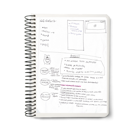
During the wireframing phase, I translated research findings into low-fidelity prototypes that prioritized clarity, ease of navigation, and quick access to key features. Every layout decision was guided by user needs identified in the discovery phase, such as minimizing complexity, offering visual feedback, and enabling quick session setup. I focused on establishing a logical information hierarchy, ensuring that the most frequently used actions (like starting a training session, reviewing statistics, and tracking progress) were immediately accessible. Interactive flows were mapped to reduce cognitive load and anticipate user behavior, while the design maintained flexibility for future iterations based on usability testing.


Once again, I confirmed that iteration is the key to continuous improvement and, ultimately, success.


result
During the wireframing phase, I translated research findings into low-fidelity prototypes that prioritized clarity, ease of navigation, and quick access to key features. Every layout decision was guided by user needs identified in the discovery phase, such as minimizing complexity, offering visual feedback, and enabling quick session setup. I focused on establishing a logical information hierarchy, ensuring that the most frequently used actions (like starting a training session, reviewing statistics, and tracking progress) were immediately accessible. Interactive flows were mapped to reduce cognitive load and anticipate user behavior, while the design maintained flexibility for future iterations based on usability testing.
DUZZ website
DUZZ App